Case Study: Gibson Guitars
Role: UI/UX DESIGN
Project Overview: The goal of this project was to perform research within the guitar marketplace, identify a segment of their target audience, audit their existing site and upgrade their brand to appeal to a diverse audience, music genres and guitar playing levels.
Problem Statement:
The existing site, while very well designed and developed, attracts a very singular audience while leaving out other target markets, musical genres, and guitar levels. I decided to focus my UI Patterns project on the Gibson guitar website considering it is one of the most iconic brands out there and given the nature of the current guitar industry, a large segment of the population and musical tastes are being overlooked within their website design.
KEY DELIVERABLES
Style Tile and Component Library
The shape and style of the gibson guitar served as inspiration for my color palette and typography choice. I wanted to create a unique color scheme focusing on the different types of wood often used in the production of Gibson guitars (rosewood, mahogany, ebony and red maple)
For typography and imagery, I chose a combination of san serif fonts, Montserrat and Fira sans. The Montserrat font has a more rounded and wider style to match the body of a Gibson guitar, while the Fira Sans has an elegant style to it but also similar to the style of the trade gothic. For images I wanted to add curves around the corners to soften up the style and get rid of the hard edges currently seen on the existing site.
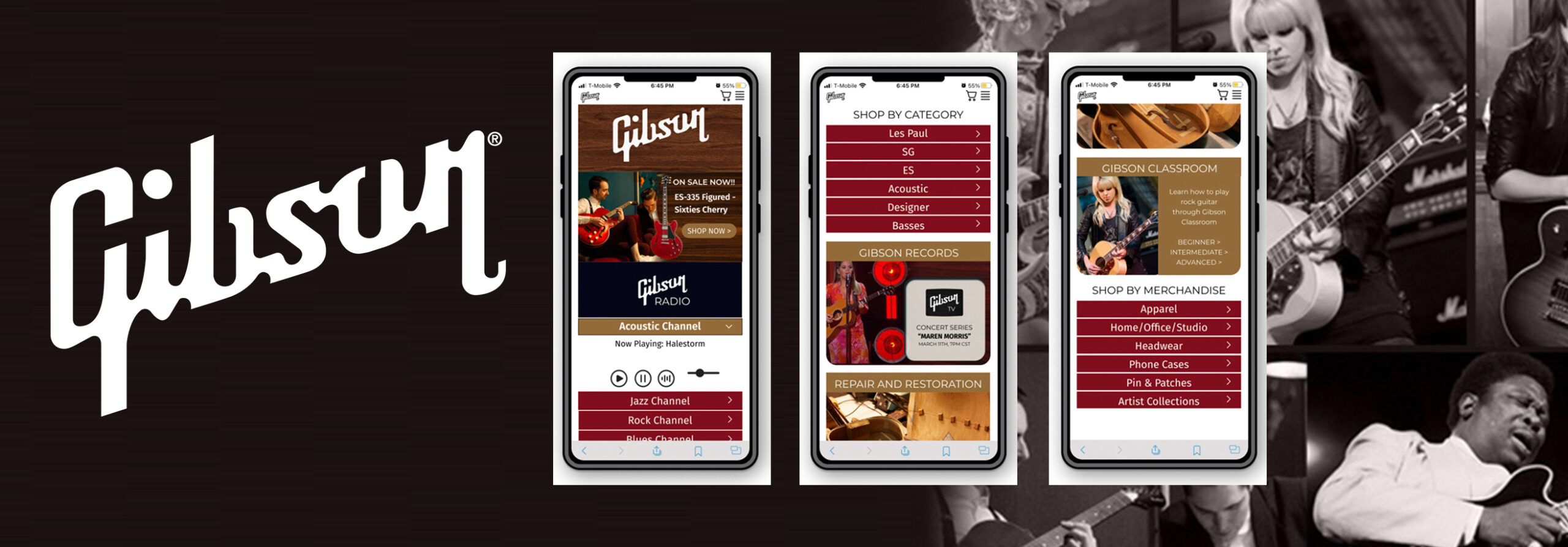
WIREFRAMES AND HIGH FIDELITY DESIGNS
When working on this website I wanted to make it accessible to people whom are visually impaired and comply with ADA standards. Therefore I wanted to design a site that integrates sound for those who may be interested in music but unable to differentiate visually between a Les Paul, ES or SG. The user would be able to listen to the different guitars prior to making a purchase. Secondly, I wanted to highlight the quality of wood used in the manufacturing of the Gibson guitar which gives it the high quality sound. Lastly, I wanted to incorporate Gibson Radio and Gibson Classroom to appeal to the emerging guitar student and also appeal to intermediate and advanced users as well.
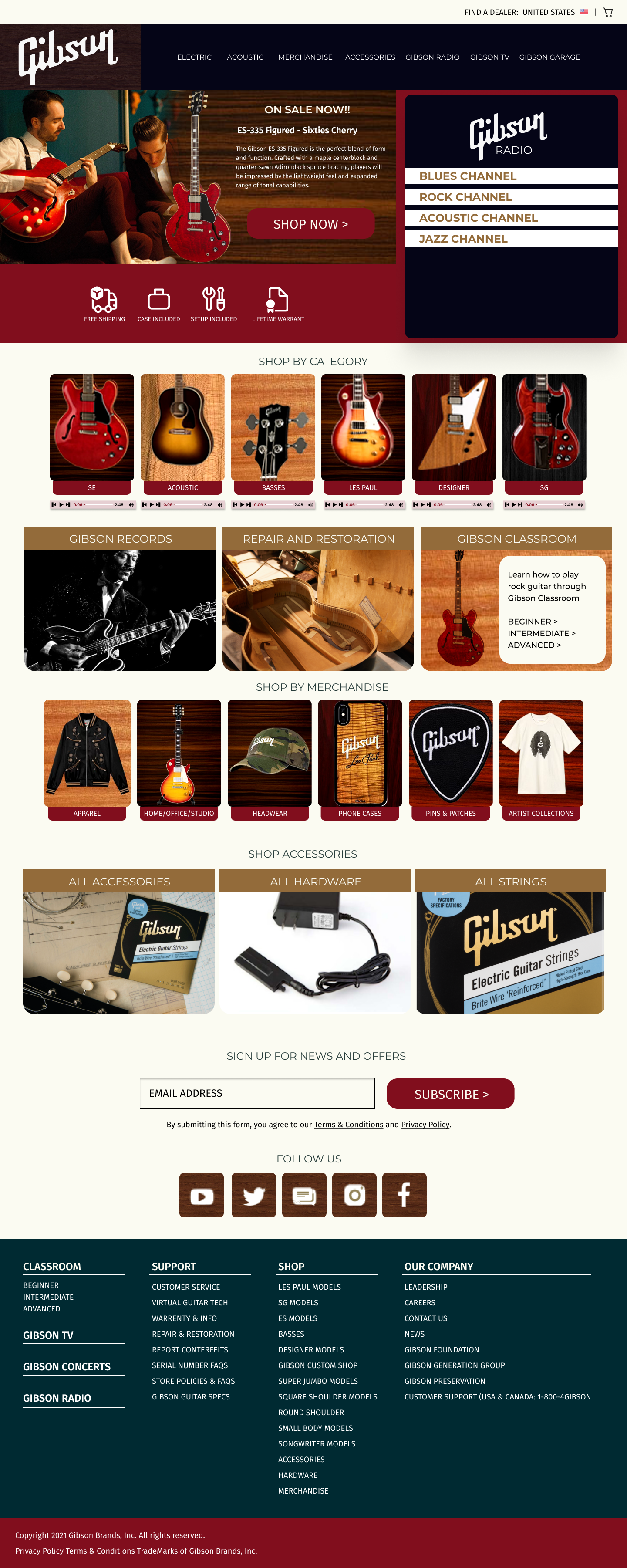
Desktop Wireframe

Desktop Design
PROTOTYPE
MOBILE WEB
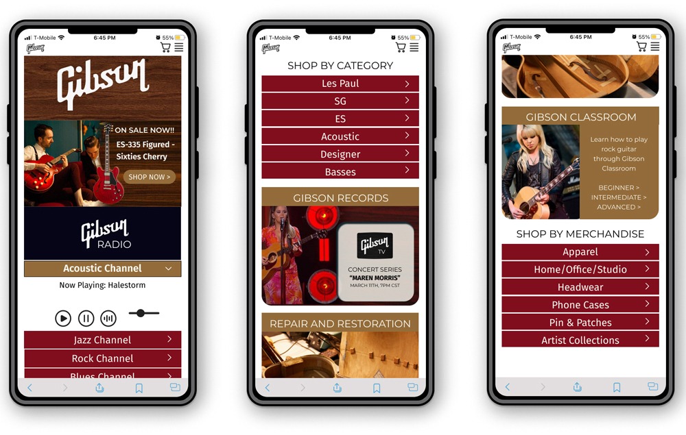
MOBILE APP DESIGNS
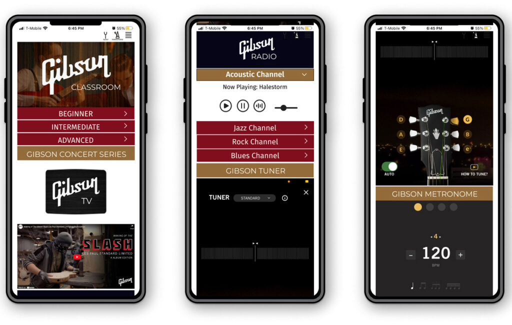
I took the existing mobile app and made it more accessible for those who may not be familiar with the icons in the top right hand corner. By adding the metronome and tuner labels next to their icons, this would help the user identify the capabilities of this app and use it for enhancing their guitar experience. I added the Gibson TV to create an immersive experience for the more experienced guitar enthusiasts, to learn about the production of the Gibson Les Paul Standard Guitar. For the to all audiences including the visually impaired, I also incorporated the Gibson radio experience to allow users to enjoy the different genres of music and musicians who integrate the Gibson guitar into their repertoire.
KEY TAKEAWAYS
The lessons I learned from this UI Pattern project was how to work with different grids, margins and incorporate a variety of components using principles of contrast, repetition, alignment and proximity.
AliExpress | Autumn’s Coffee Shop | Bill Gallen Fine Art | Design For Good | DCI Marketing | Fitzgerald Collingsworth & Associates | Gibson Guitars | NIKE SNKR App | Ruach Inc.