Case Study: NIKE SNKRS APP
Role: UX RESEARCH/UI DESIGN
Project Overview: The goal of the project is to design the Nike Community App containing a feature for customers to discuss and share their love for Nike sneakers. My team, consisting of 4 members, developed this app through our UX/UI certification program.
Problem Statement:
“How will Nike create a community within the SNKRS app? How will they make this app a desirable destination with compelling content while also increasing positive user engagement?”
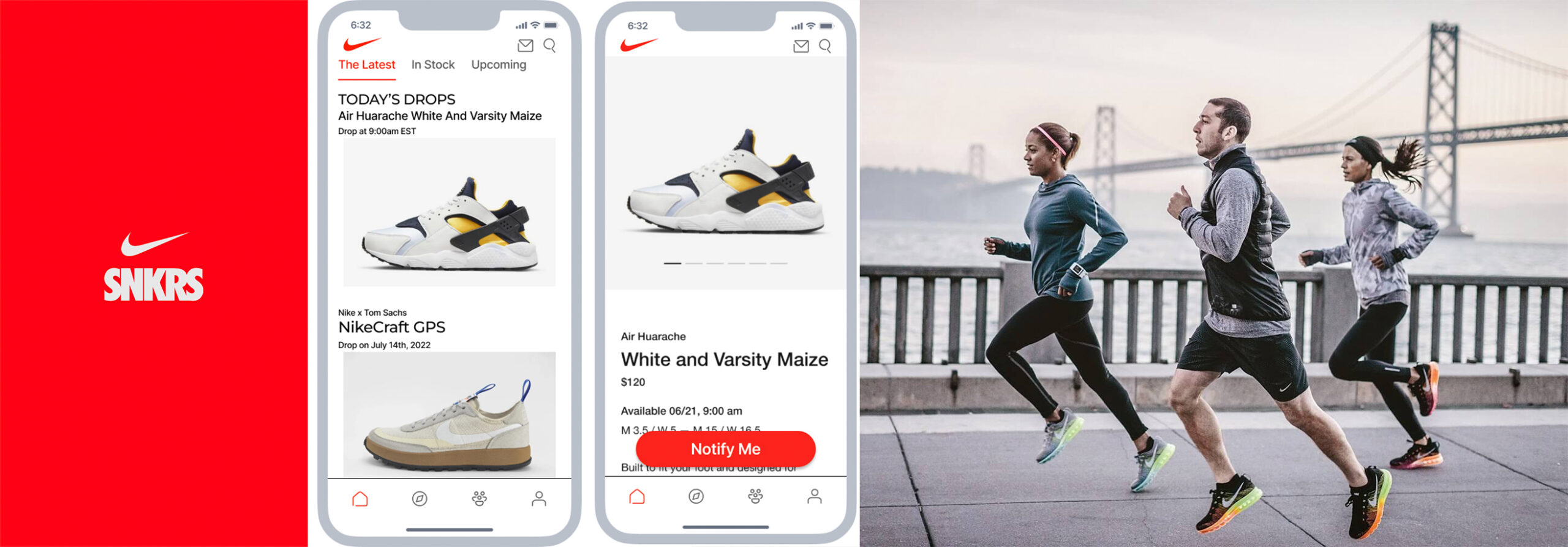
Prototype
Key Deliverables
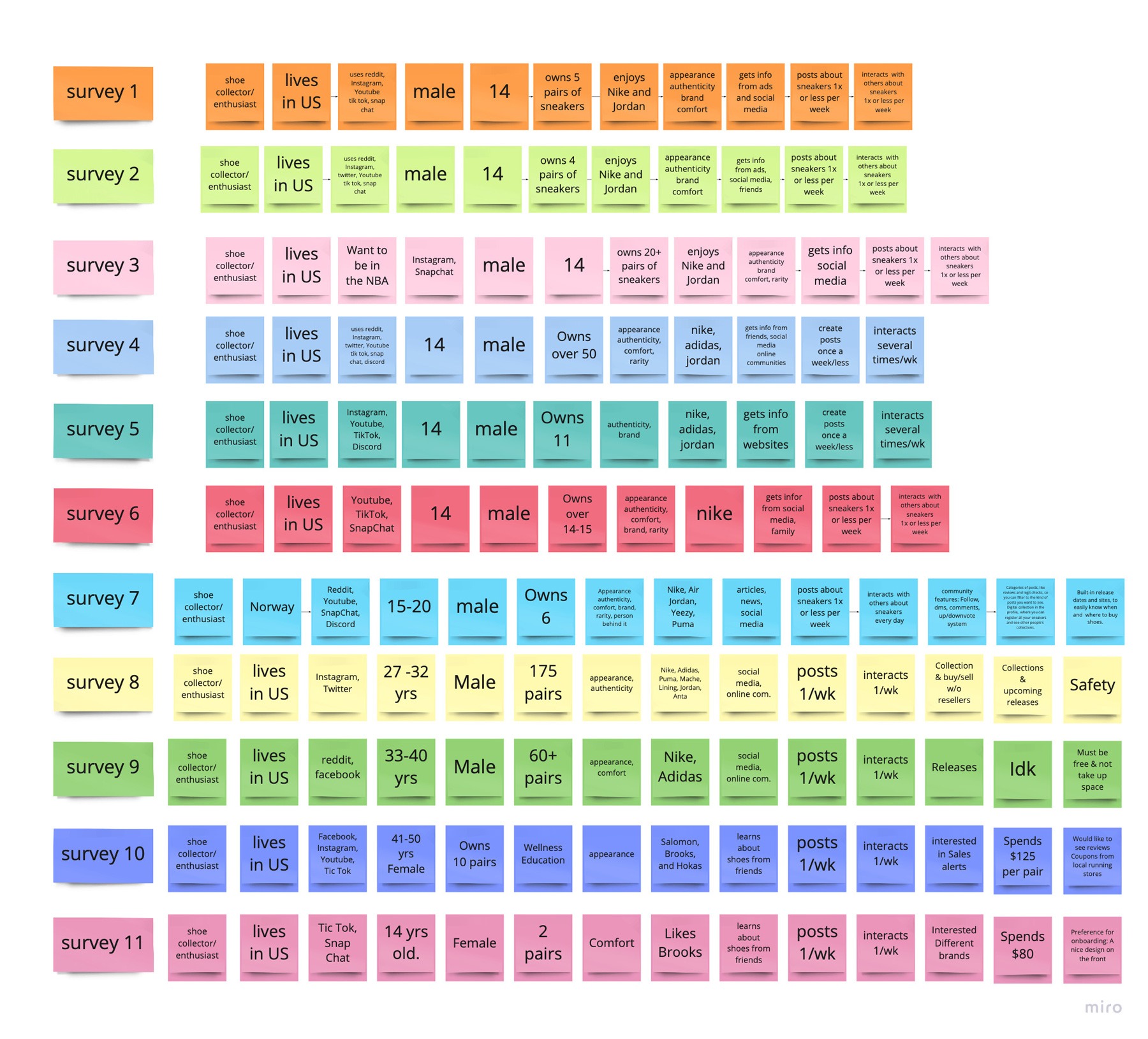
Surveys
We conducted a survey to learn about our core audience and were able to get over a dozen recipients to participate. We asked a variety of questions such as:
• Country/State participant resides?
• What social media platforms do you use?
• Participant’s age?
• Gender?
• How many pairs of sneakers do you own?
• About how much do you spend on a pair of sneakers?
• What makes a sneaker special to you?
• What sneaker brands do you enjoy?
• Where do you usually get information about sneakers from?
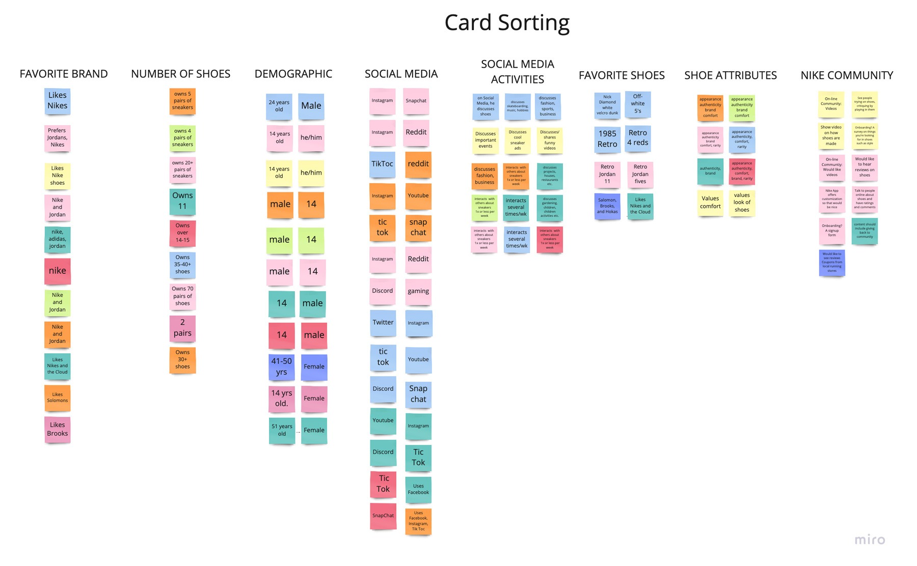
Card Sorting
We organized the information from the surveys and created categories as shown here which includes demographic, activities on social media, brands, shoe attributes etc.
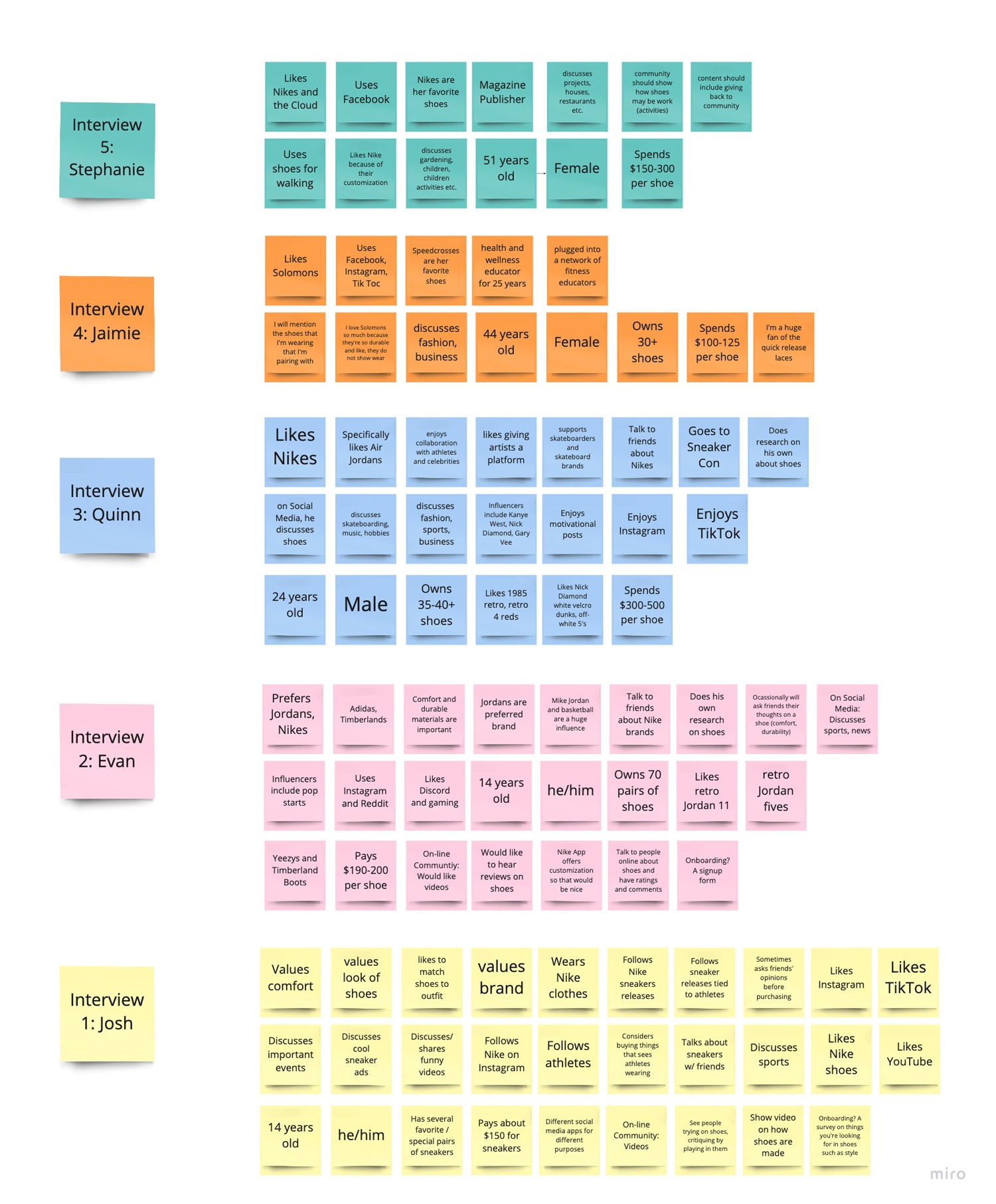
Interviews
Based on our survey we asked participants if they would be willing to participate in an interview and we were able to conduct 5-6 interviews. We asked them additional questions based on the survey which include topics discussed on social media, what sets nike or any preferred brand from others, who do you go for advice on shoes, If there were an online community specifically for Nike enthusiasts, what features would you like to see and why?
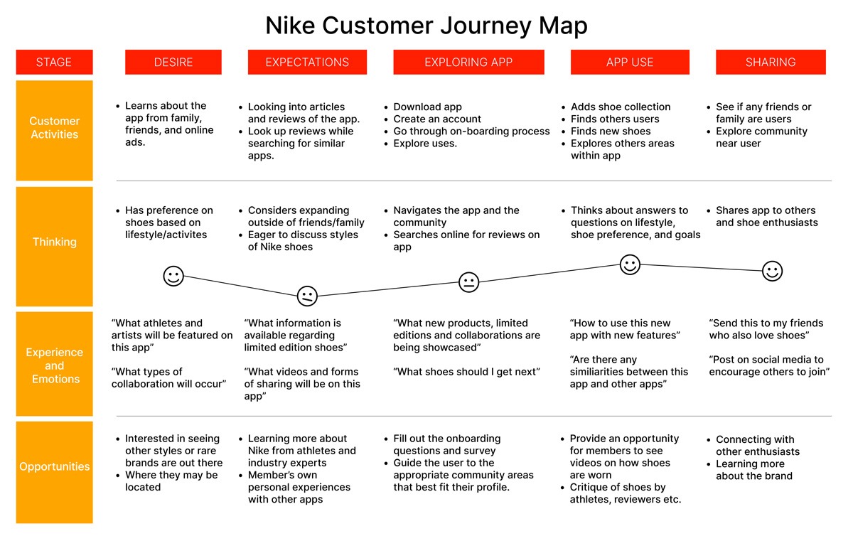
Journey Map
Our goal through this journey map was to create a timeline of actions and behaviors between the user and community app. By organizing this map into the following categories: thoughts, feelings behaviors and possibilities, this helped create a roadmap for this Nike Community App and understand how the user will navigate the different features available.
UX DELIVERABLES
Style Guide
For the style guide wanted to use current colors but also add a secondary analogous color
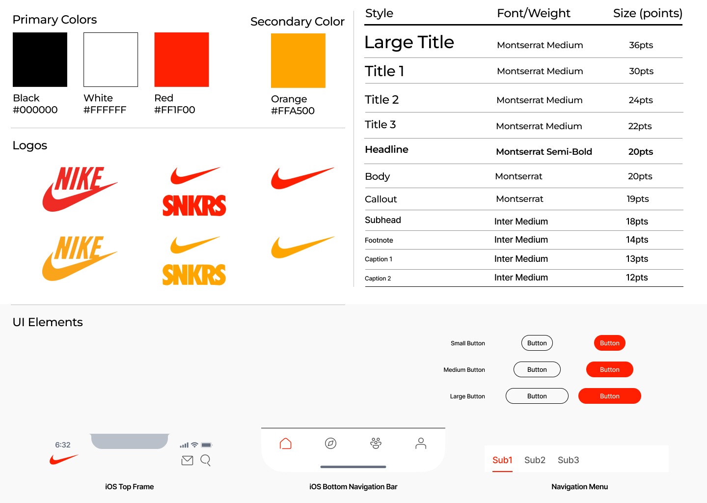
- Similar icon style as current app
- Consistent Nike logo for more branding
- Referenced AHIG for fonts
High Fidelity Prototype
We wanted a seamless transition from the current app to integrating these news features. Our main focus was creating a community within what already exists, and making it everything’s a sneakerhead would want.
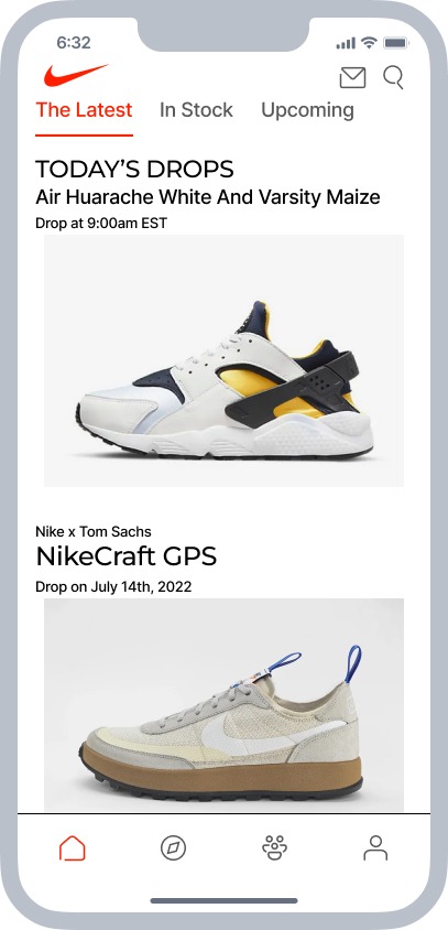
Home Page Prototype
To start, the Home page shows off the most recent shoe drops along with two navigation bars and information buttons. Messages icon has now been moved to the top and the community button at the bottom now replaces that messages button. Notify me button draws the eye and can inform you on a specific shoe.
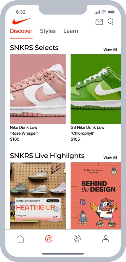
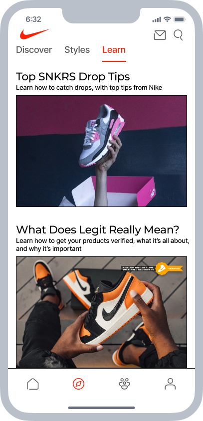
Discover Prototype
Discover page shows off selected sneakers and highlights from the community. We also added a learn page to make a more inclusive and interesting app, with articles to learn from. We think this will expand the app into users interacting with articles and other users.
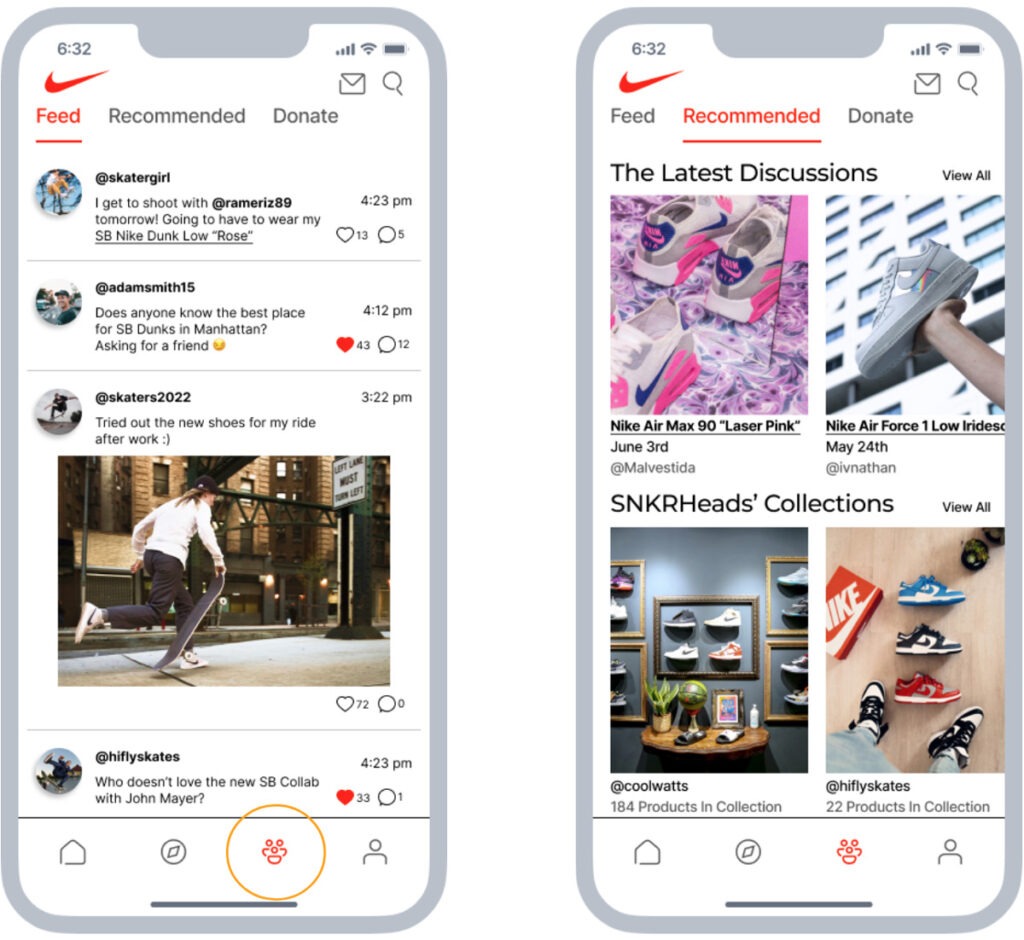
Community Prototype
The community tab shows off what we think the user would engage with most frequently. We want to display articles and other users posts within the recommended section to have users interact with it. We also have a donate tab at the top to donate shoes or funding to those in need.
User Collection Prototype
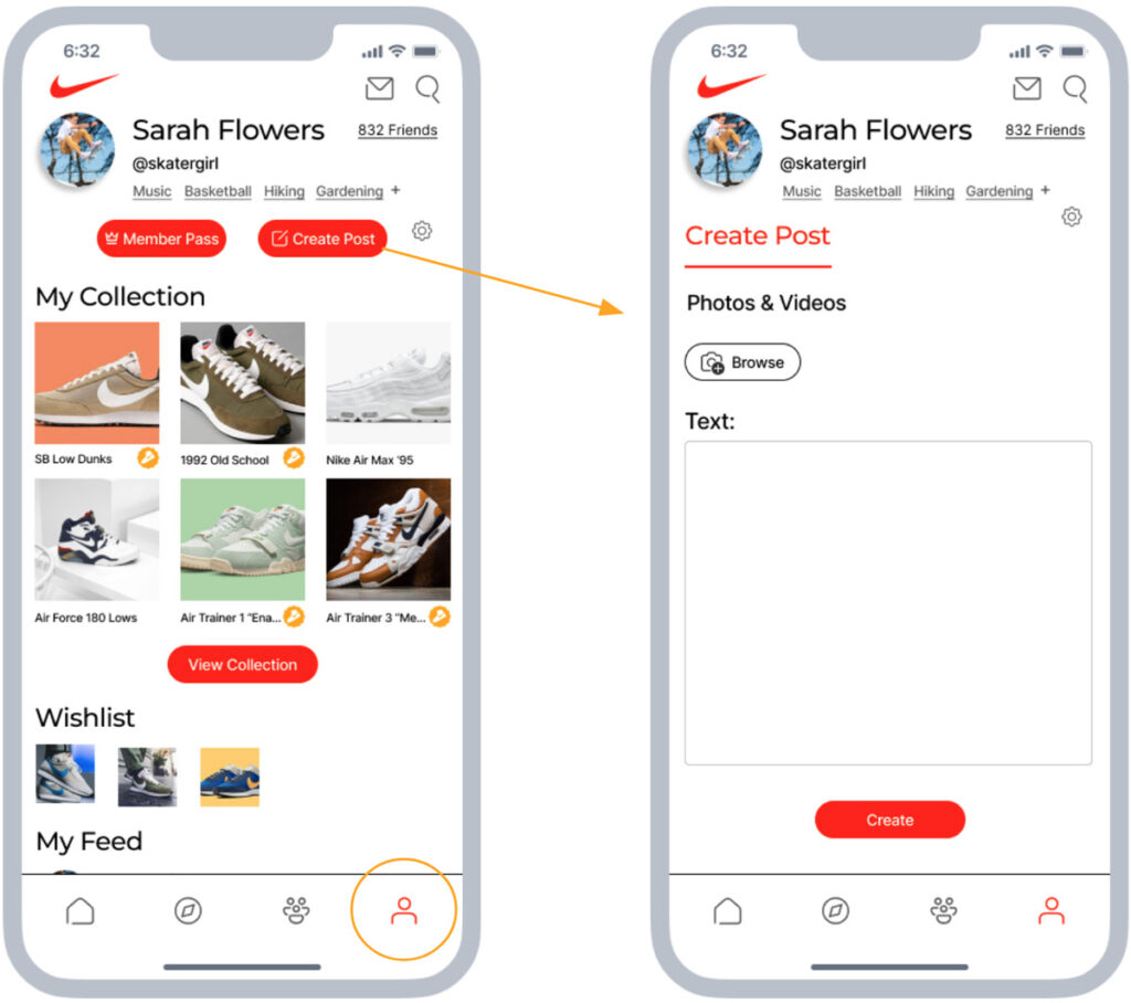
This is the layout for a profile as if we were Sarah. This is the users perspective, It includes a name, username, and interests. Customization for interests is allowed with a plus button if you have a new hobby you want to replace an old one. From there, we allow users to show off their favorite six pairs of shoes along with a preview of their wishlist and what is upcoming for them.
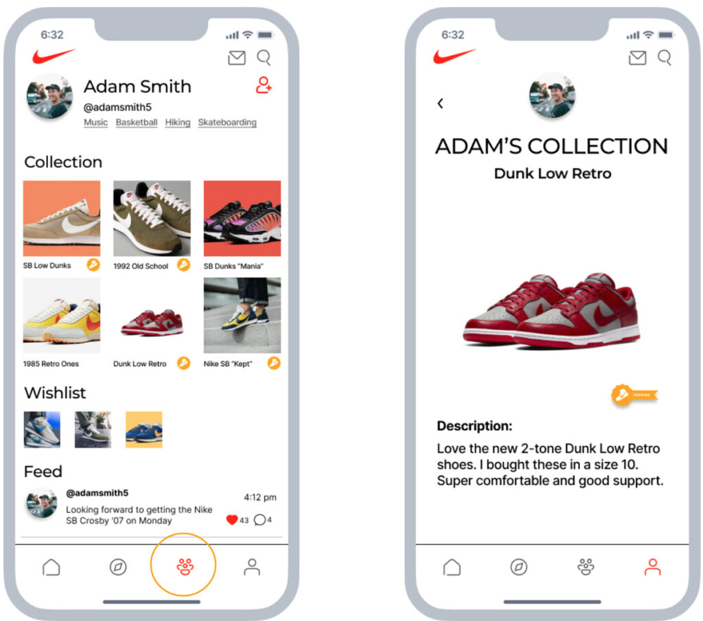
User Profile Prototype
From here, we wanted to create a place for users to make their own personal space, and show off their favorite shoes they own. Within the collection, we have the ability to share the shoes they have, verify a shoe, or edit the post from when they got that shoe.
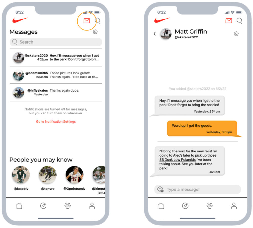
Messages Prototype
Here is what the messages now looks like, with an example of the messages main screen and an actual message. “People you may know” may increase positive interactions. We feature some people you may know at the bottom, which helps grow your profile.
Usability Task Flow
This is the user testing task flow to test how a customer would navigate through our community application and provide them with ways to find other community members, connect with them, share posts and more.
User Tasks for Testing
1. Browse Discover & Community Tabs
2. View your Profile (Sarah Flowers)
3. View your Collection
4. View another User’s Profile (Adam Smith)
5. Message another User
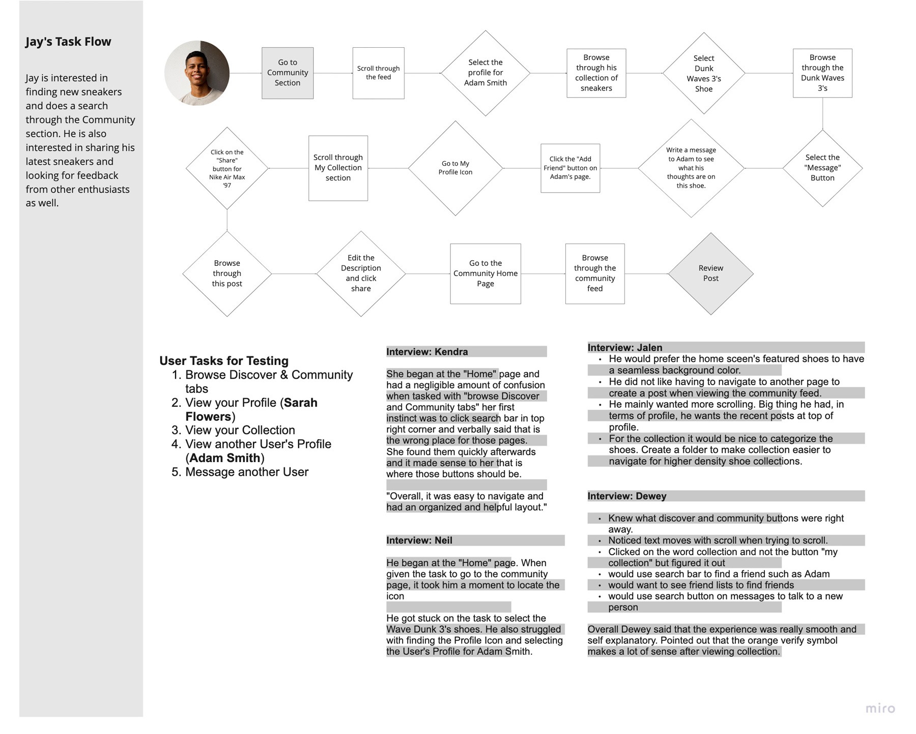
Task Flow Results
Our Interview Results provided us this feedback
Pros:
- One participant knew where the community buttons were right away.
- User comment: “Overall, it was easy to navigate and had an organized and helpful layout.”
- One participant had a very smooth experience and felt the orange symbol makes sense when viewing one’s collection.
Cons:
- A couple of participants were confused when given task to browse Discover and Community tabs.
- One User’s first instinct was to click on the search bar in right-hand corner.
- One participant expressed interest in seeing scrolling.
- One struggled to locate and select the User’s Profile.
Suggestions:
- One participant suggested categorizing shoes in the collection section, which would make this section easier to navigate.
- On the home screen, have featured shoes contain a seamless background.
- Have recent posts at the top of the profile.
- Provide a friends list section to find friends more readily