Case Study: AliExpress
Role: UX Research
Project Overview: Enhance consumer confidence, retention and experience through the AliExpress website. Provide a seamless search experience for a variety of users, and modernize the design interface.
Problem Statement:
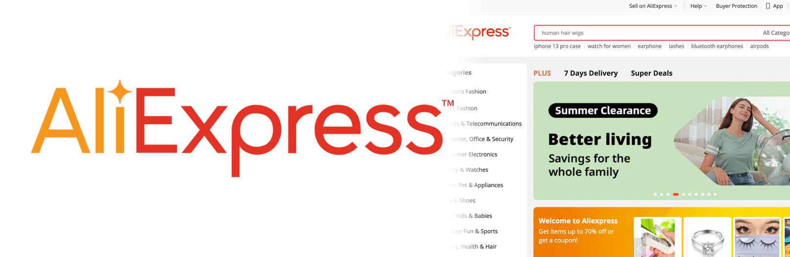
Despite Alibaba’s success with B2B customers, B2C customers lack trust for AliExpress. Customers report feeling that the site seems sketchy or untrustworthy. Aiming to compete with retailers such as Amazon, Walmart, Target and Costco in North America, AliExpress needs its site to showcase the reliability of its brand.
Key Deliverables
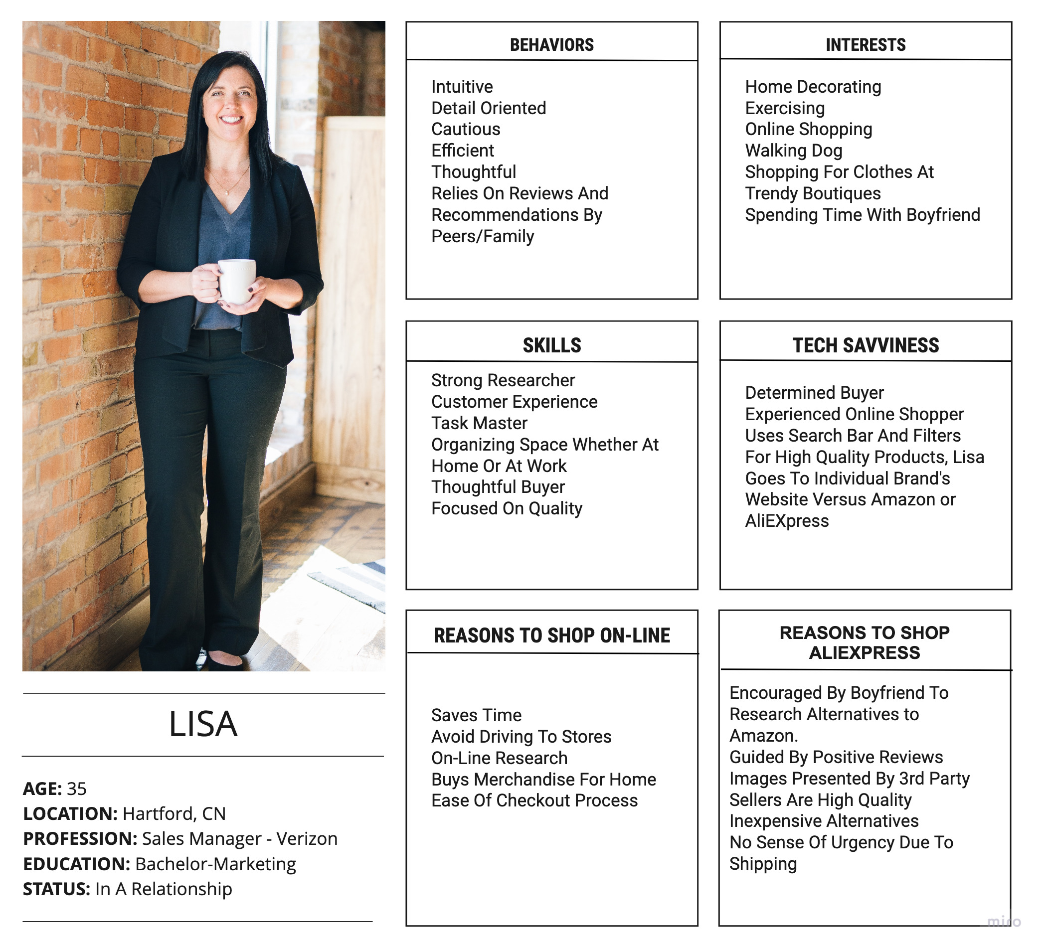
User Persona
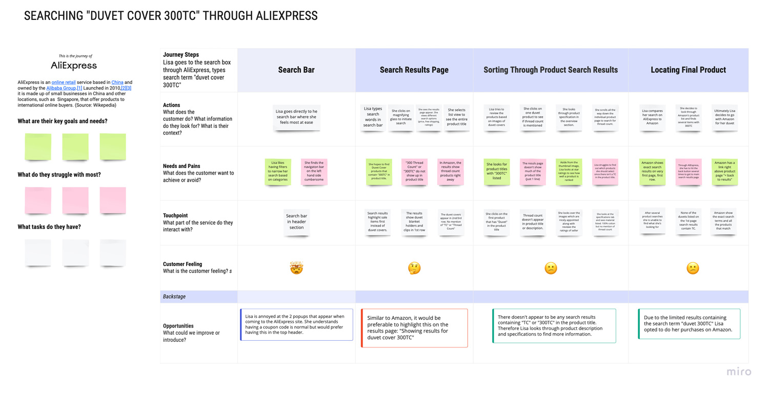
Journey Map
My goal with this deliverable was to perform a test search action using the term “Duvet Cover 300 Thread Count (TC)” to see what search results are available through the AliExpress website versus that of a competitor such as Amazon or other on-line retail outlets. As you can see within journey map the process of locating merchandise fitting these keyword terms leads to unsatisfactory results and ultimately affects the overall user experience.
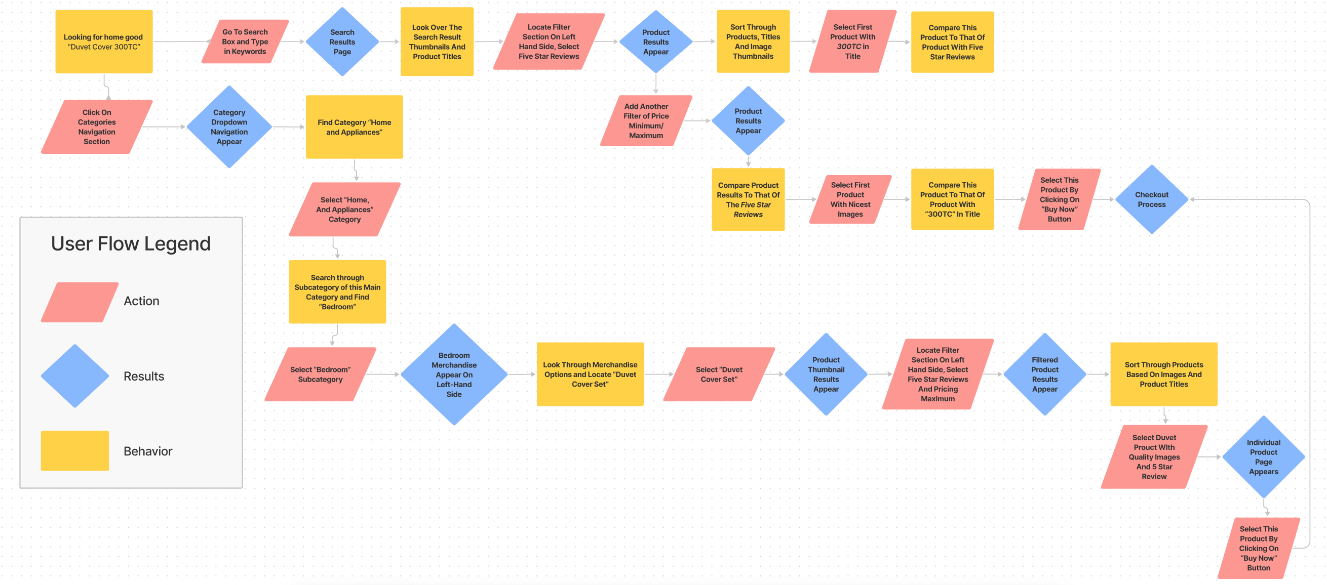
User Flow
I supplemented the journey map with a user flow to learn how a user would navigate the website using different search methods in a step by step process. By performing this activity, this would help guide me in creating an architecture and mid-fidelity wireflow for this website
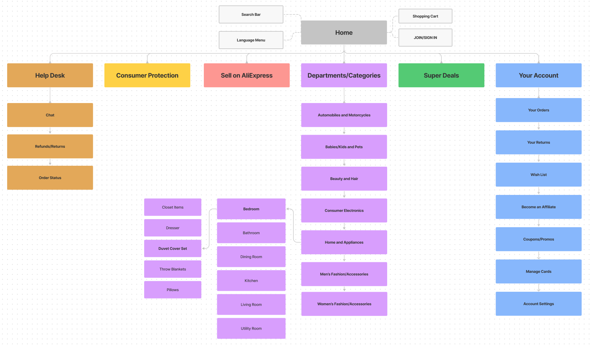
Site Architecture
Through this site architecture, my goal is to streamline the search process for the particular product through an upgraded navigation system. I updated the different shopping departments to include “Home/Appliances / Bedroom / Duvet Cover Set” The search bar and the individual products page would incorporate keywords within the breadcrumbs, title and descriptions to yield better search results.
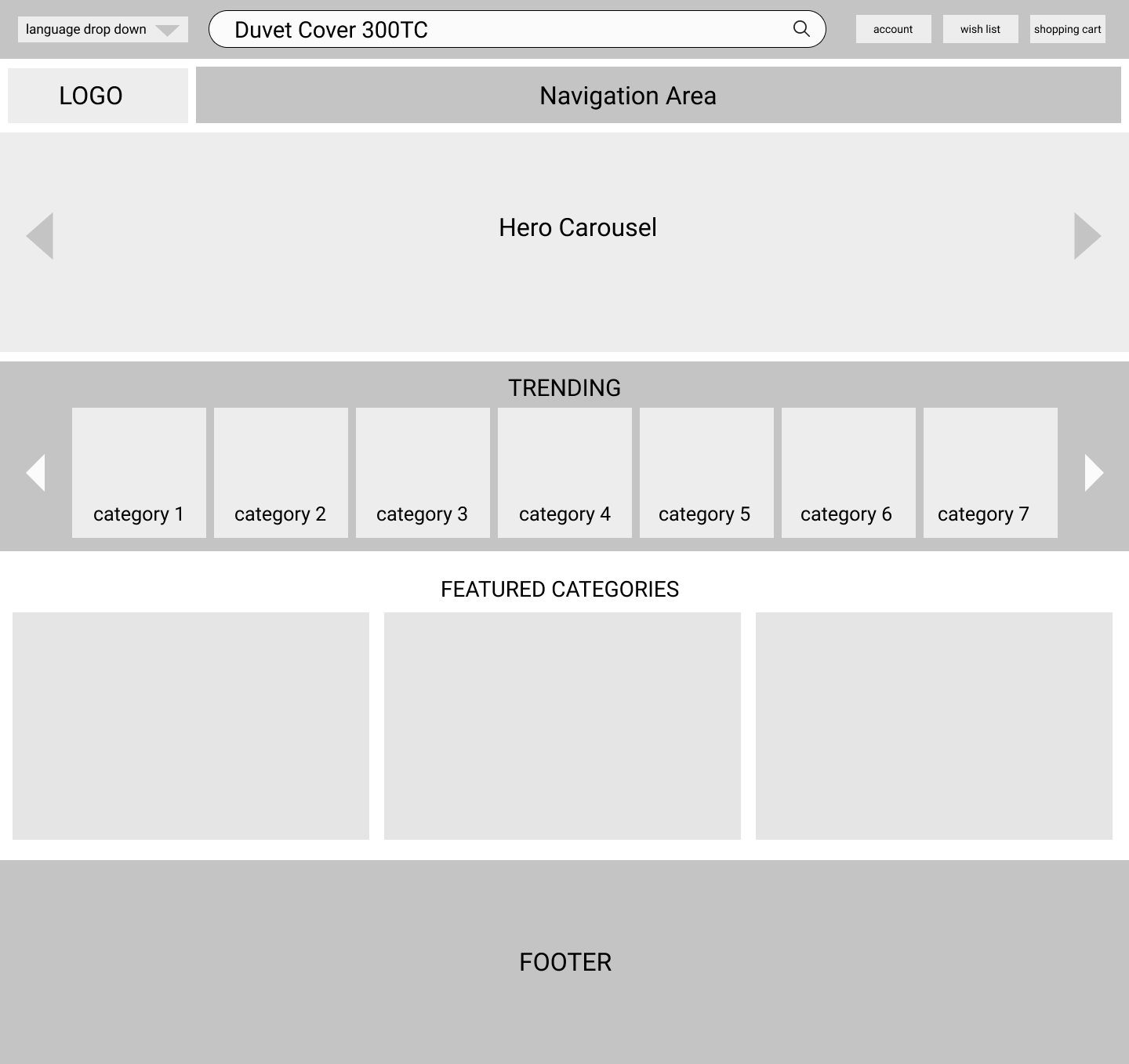
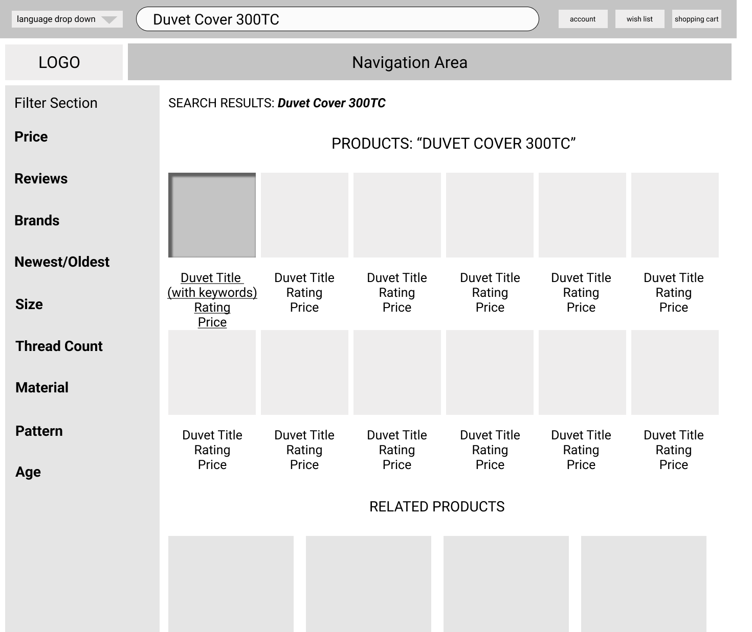
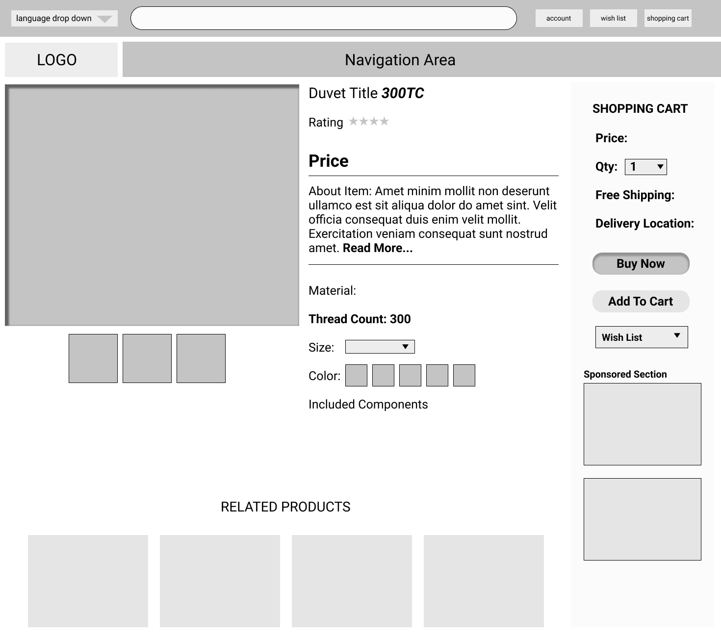
Wireframes
Theses wireframes below provide a mid-fidelity representation on how the home page, search results page, individual product page and checkout page. The page layout is focused on imagery while emphasizing shopping categories, keywords and product titles to provide the shopper with a user friendly and easy to navigate shopping experience.
AliExpress Wireframe Home Page
AliExpress Wireframe Product Search Results Page
AliExpress Wireframe Individual Product Page
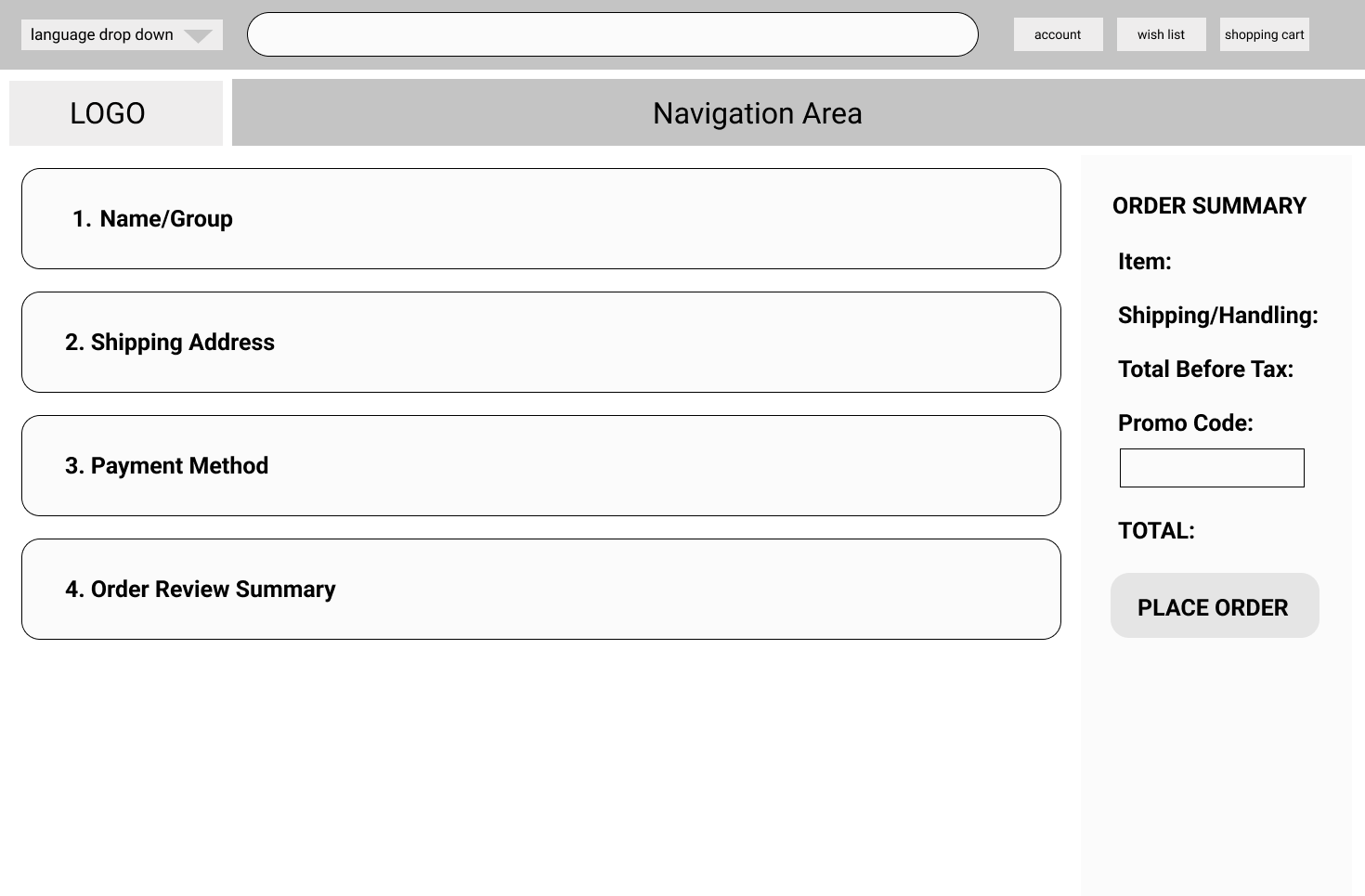
AliExpress Wireframe Checkout Page
Key Takeaways
- Remove the AliExpress website pop-ups as this is very distracting to the user and may be a source of irritation prompting a user to exit the site immediately versus engaging a prospective shopper.
- Modernize the logo and typeface used throughout the site. For example, use Google font pairing: Poppins and PT Serif
- Reconfigure the website real estate to have the primary navigation go across the top of the page.
- Update the color scheme as red and orange/red may be limiting to people who are color blind, 99% of all colorblind people are suffering from red-green color blindness. (Source: https://www.colorblindguide.com/)
- The top header above the logo/navigation and search bar contains a graphic and promo that does not appear cohesive with the rest of the design. For a user, this may discourage them from clicking on the promotion link as it may feel like this is clickbait versus adding an AliExpress promotion to one’ shopping cart.
- To eliminate the business of the site, add more spacing between the products and product categories. Shrink the number of products per row to 4 and reduce the content to 3 lines highlighting the product title, price, ratings (with # of stars). If people see a 1 star next to a product they will immediately assume that this is the rating of this product.
- The way the pricing is displayed with the first number’s font size increased and bolded seems unnecessary. Simply make the entire price the same size and bold it or add a different color to make it stand out. Playing around with different sizes in 1 line doesn’t feel polished or elegant from a UI point of view.
