
Case Studies
Here are several case studies I have created to provide an overview of some of my prior UX/UI work. This overview includes client projects as well as work related to my UX/UI Design certification through UW-Madison.
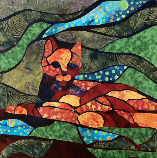
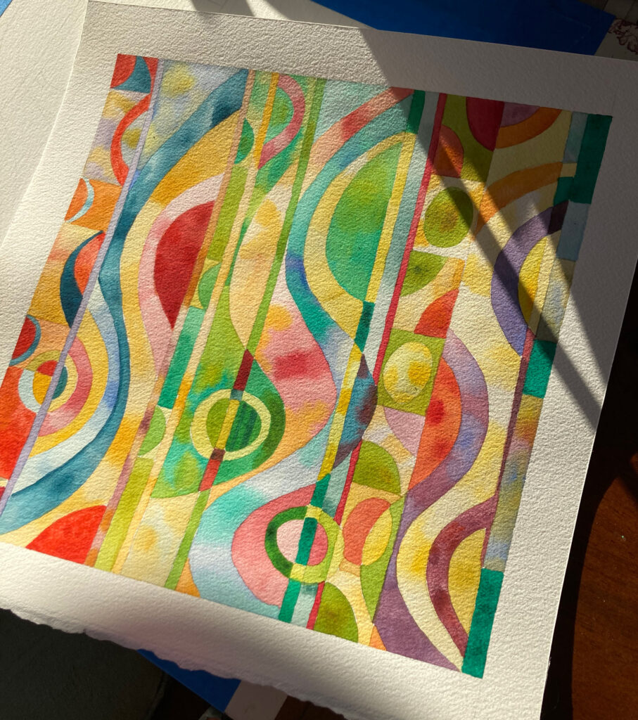
Fine Art Gallery


Case Study: Pat’s Coffee Shop
Due to the pandemic, Pat’s coffee shop needed to shift their business model to a virtual format in order to promote their products and services.

Case Study: NIKE SNKRS APP
The goal of the project is to design the Nike Community App containing a feature for customers to discuss and share their love for Nike sneakers.
